Having enjoyed making the first dress, I went back to JoAnn Fabrics, bought another pattern (Vogue 8381) and made another dress.
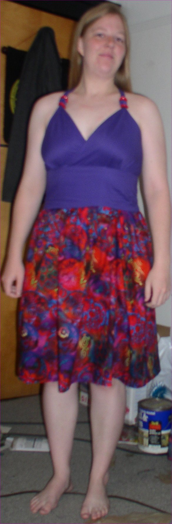
I’m not sure I like how this one turned out as much — it hangs a little too high above my waist and the stitching isn’t as even as I’d like it to be. This pattern was a bit trickier than the last one. The bodice has a lining, which means that everything had to be done twice and in exactly the same manner for things to meet up right. I didn’t quite succeed at that, hence the slightly uneven waist line.
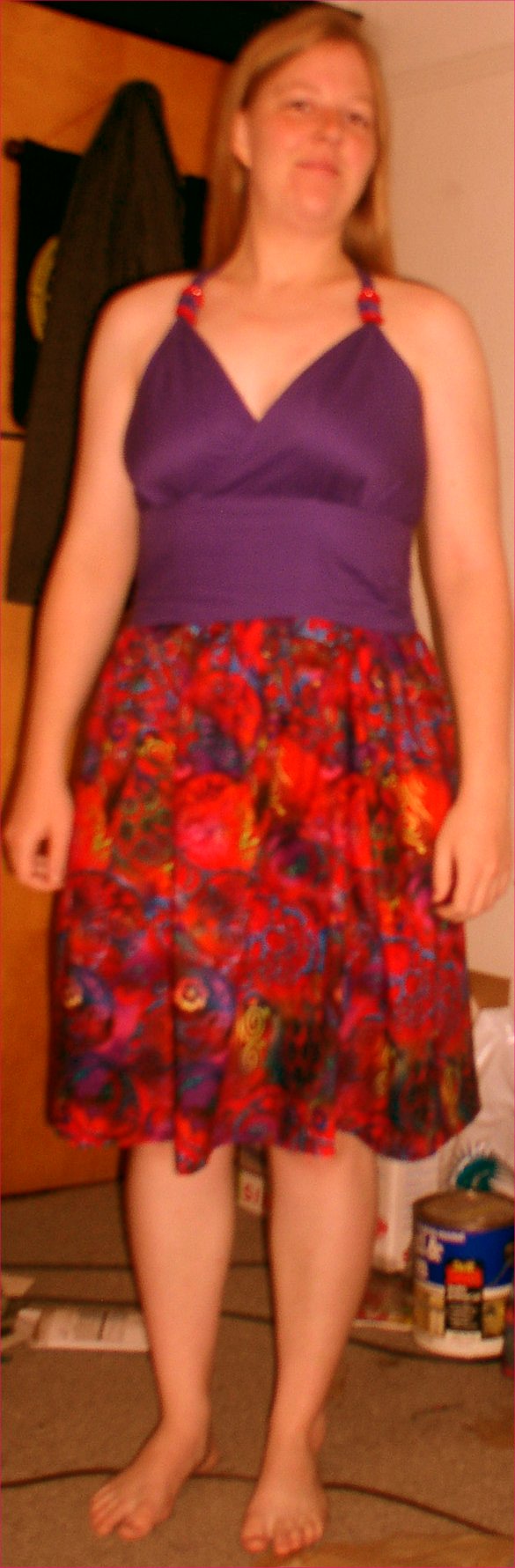
Also, strangely enough, my camera does not like to pick up the color purple resulting in the bodice looking a lot bluer than it actually is (left image). (I’ve noticed this before… is there any reason why a lot of cameras don’t pick up purple well? Johnston, I’m looking at you.) I adjusted the colors in Paint Shop Pro, but once the top was close to it’s actual purple color (right image), the skirt and my skin were too orange. Ah, well… use your imagination to get the idea of what the real dress looks like.
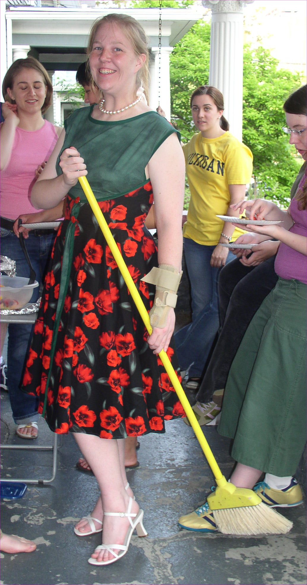
And as an extra bonus, we had a barbecue at my house, and I wore the first dress, along with the pearls Jenn gave me for being in her wedding. To complete the image of the 1950s housewife, I was given a broom while my friend Cailin took a picture. I submit for your mockery, the resulting photograph:
May27

Hehe — that’s awesome! I wish I could make dresses … something to pass the time 😉 I suppose I should get back to my crochet’d afghan … I’ve finished one out of 63 squares!
Speaking of (nope, not related) — are you going to be able to make it to the Pi Reunion? Lisa, Matt, Tina and I are going (and possibly other people you know). It would be great to see you again!
The color problem could be the camera, but it’s probably the lighting. Most of our lighting tends to be orange, which is opposite blue on the color wheel. So perhaps when Paint Shop Pro adjusts away from orange, it makes other things too blue.