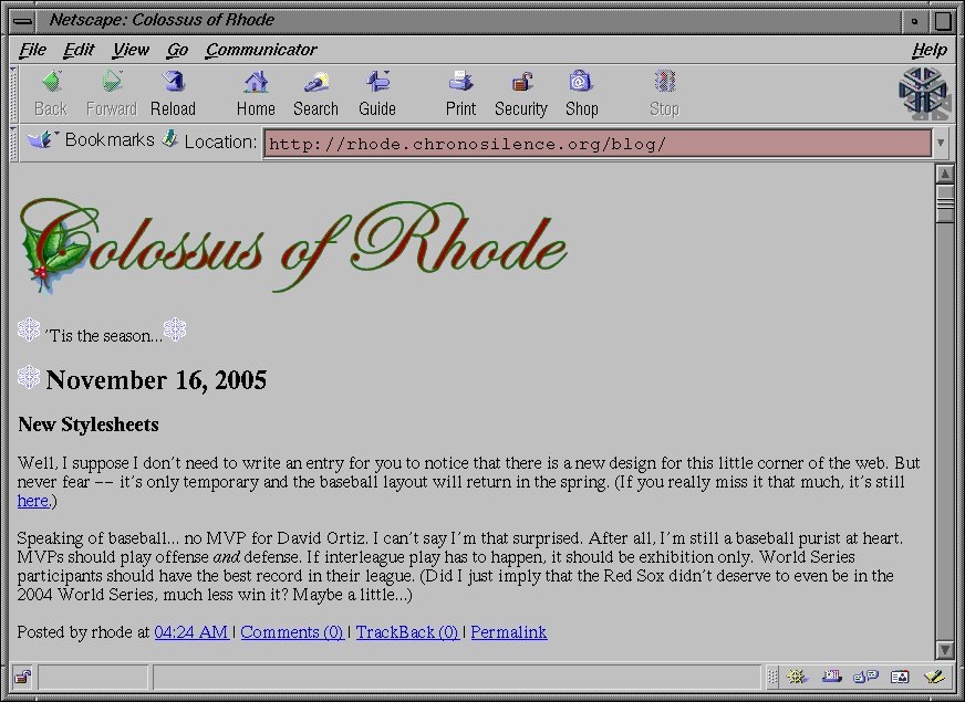
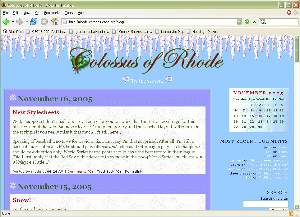
There are very few fellow MIT alums who are slower than I am at picking up on modern technologies. Scott Johnston is one of those people. Our resident loveable luddite sent me a screen shot of what he sees when he looks at my blog, stating “My web browser still rocks.” So I thought I’d give him a chance to see what he’s missing and give the rest of you a glimpse of the world from Scott’s point of view. (Of course, I’m putting the images in a table — that might be a problem for those of you using lynx.)
 |
 |
| The Johnston View | The Rhode View |
At least he’s moved up to using a browser with graphics. Welcome to the 90s, Scott! As for me, I’m still not sure about the icicles. The top banner looks really empty and unbalanced without something there, but with it I’m beginning to think it’s a little too cluttered. Anyone with a browser that can see them want to weigh in?

I think they take over your heading. Perhaps if you lowered the heading a bit it would look better.
No icicles might look better too…
*gasp* i love the icicles! no getting rid of them.
To determine if the icicles should stay or go, one should remember the inherent nature of ‘cicles. Of course they run into and attempt to take over your heading, that’s what they do.
IF I was to suggest anything it would be the following. This is a case of more being more, not less. To maintain the baseball theme, since you suggest that this is a baseball-themed blog, which I question since when it discusses baseball it discusses the Red Sox, and that’s just barely baseball, but if it is, then I’d modify the C of Colossus to contain a hotstove.
Secondly, the only problem with the icicles is that they are too uniform, but that can be a bit tricky to change. I’m sure a quick search and you can find some twinkling Christmas lights (see http://www.christmasgifts.com/clipart.html for some samples).
On the other hand, perhaps you are attempting to be tasteful as well as seasonal?
the icicles bother me. not sure why. maybe something like a nice thick line in a different color?
While animated twinkling lights was tempting, I went with some prairie snow drifts (sorry to Jenn d’Ascoli) and a new font for the title, which is appropriately named “White Christmas.”
Any more thoughts?